Brain Parcellation and Extracting Regional Time Series
Using Atlases to Divide the Brain into Regions: Parcellation
A preprocessed resting-state fMRI scan is still a very large four-dimensional image containing hundreds of thousands of voxels measured across hundreds of time points. While this contains a tremendous amount of information, it is not yet in a form that is easy to interpret or analyze.
Therefore, once we have downloaded and become familiar with the preprocessed fMRI data, the next step is usually to divide the brain into regions. We call this process brain parcellation. In simple terms, parcellation is the process of dividing a complex, high-dimensional brain image into smaller, distinct regions that are relatively homogeneous in their structure or function.
What Is Brain Parcellation?
Brain parcellation refers to the process of dividing the brain into regions that will serve as the basic units of analysis.
A useful analogy is to imagine studying a country. Instead of tracking every individual house, it is often more practical to divide the country into cities, districts, or provinces and study those larger units. Similarly, rather than analyzing hundreds of thousands of individual voxels, researchers group voxels into meaningful brain regions.
Once the brain has been divided into regions, we can summarize the activity within each region and study how different regions interact with one another.
This greatly reduces the complexity of the data and makes it possible to construct functional brain networks.
Why Are There Different Parcellations?
There is no single “correct” way to divide the brain.
Different parcellations are designed for different scientific purposes.
For example:
Some parcellations include only the cerebral cortex, while others include both cortical and subcortical structures.
Some are based primarily on anatomical boundaries.
Some are based on patterns of functional connectivity.
Some divide the brain into a relatively small number of large regions.
Others divide the brain into hundreds or even thousands of smaller regions.
As a result, researchers often choose a parcellation based on the goals of their study.
Examples of commonly used atlases include:
AAL (Automated Anatomical Labeling)
Schaefer Atlas
Yeo Networks
Glasser Atlas
Harvard-Oxford Atlas
Different choices can lead to slightly different analyses and interpretations, which is why selecting an appropriate parcellation is often an important methodological decision.
Which Parcellations Will We Use?
For the competition, we have parcellated the brain using two commonly used atlases:
AAL Atlas
The AAL (Automated Anatomical Labeling) atlas divides the brain based on large-scale anatomical landmarks, such as major gyri and sulci. The version used in this competition contains 167 regions spanning cortical and subcortical structures. https://
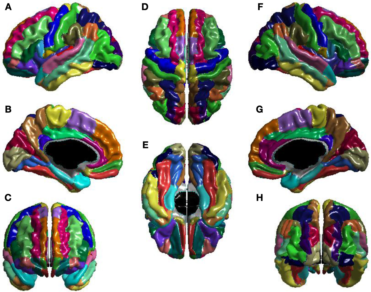
AAL atlas viewed from multiple perspectives. (A) Left lateral, (B) left medial, (C) anterior, (D) superior, (E) inferior, (F) right lateral, (G) right medial, and (H) posterior. Colors identify anatomical regions and are used only to distinguish region boundaries. The cortical parcellation is based primarily on anatomical landmarks such as gyri and sulci. Adapted from Lewis et al. (2013)
Schaefer Atlas
The Schaefer 2018 atlas is one of the most widely used functional brain parcellations in modern neuroimaging (Schaefer et al. (2017)). Unlike anatomical atlases, which divide the brain based primarily on visible anatomical landmarks, the Schaefer atlas was derived from patterns of functional connectivity observed in resting-state fMRI data.
The Schaefer atlas builds upon earlier work by Yeo and colleagues (2011), who analyzed resting-state fMRI data from approximately 1,000 healthy participants and identified seven large-scale functional networks that consistently emerged across individuals. Brain regions that exhibited similar patterns of communication with the rest of the brain were grouped together into common functional networks.
The Schaefer atlas extends this idea by providing a finer-grained subdivision of the cerebral cortex. Instead of assigning each location in the cortex to one of seven large networks, the cortex is further divided into smaller regions that preserve the functional organization identified by Yeo and colleagues.
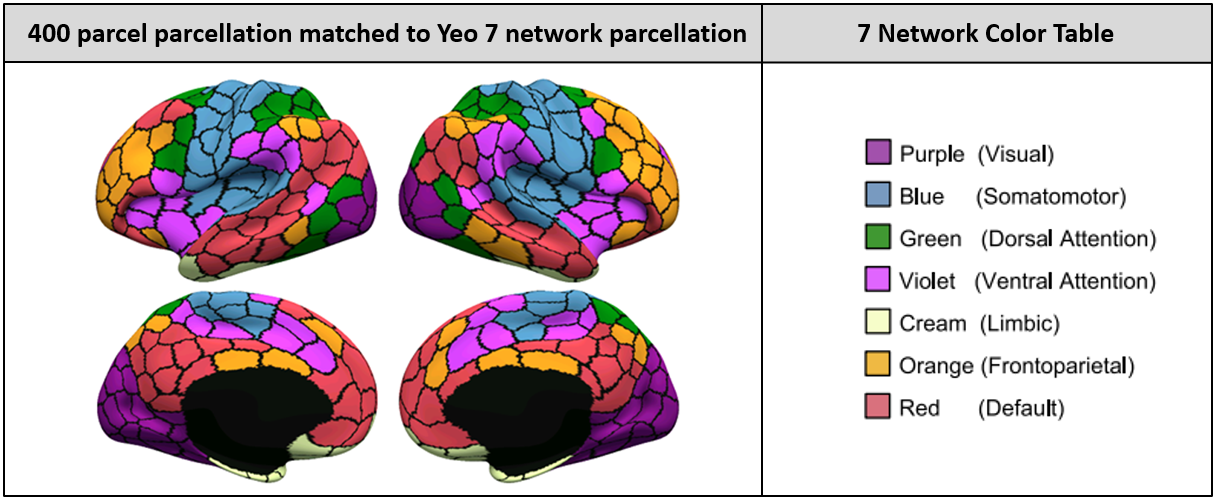
The Schaefer 2018 functional atlas. The cerebral cortex is divided into smaller regions based on patterns of functional connectivity while preserving the large-scale network organization originally identified by Thomas Yeo et al. (2011). Different colors correspond to different large-scale functional networks. Adapted from Schaefer et al. (2017).
For the competition, we provide data using either the AAL or Schaefer100 parcellation.
This means that you do not need to perform the parcellation step yourself.
For participants interested in learning more, we provide an optional guide demonstrating how to select and apply different parcellations using the Nilearn package. Exploring alternative parcellations can be a useful extension project, but it is not required for the competition.
From Brain Regions to Time Series
Once a brain has been parcellated, the next step is to extract a time series for each region.
Recall that a resting-state fMRI scan is a sequence of brain images collected over time.
For every voxel, we can measure how the MRI signal changes throughout the scan.
After parcellation, we combine the signals from all voxels belonging to a particular brain region and summarize them into a single signal representing that region.
The resulting sequence of values over time is known as a time series.
For example, participants in the LEMON dataset underwent a resting-state fMRI scan lasting approximately 15 minutes and 30 seconds. During acquisition, the brain was sampled every 1.4 seconds, producing 657 volumes (time points).
If we divide the brain into 100 regions using the Schaefer100 atlas, we obtain:
100 brain regions
×
652 retained time points for each of the 100 regions
=
100 regional time series
Each regional time series describes how activity in that brain region fluctuates throughout the scan.
A simplified representation might look like:
              Time Point
Region      1    2    3    4   ... 652
---------------------------------------
Region 1   ...  ...  ...  ...       ...
Region 2   ...  ...  ...  ...       ...
Region 3   ...  ...  ...  ...       ...
...
Region 100 ...  ...  ...  ...       ...
The values themselves represent the fMRI signal measured within each brain region at each time point.
See the visual illustration below:
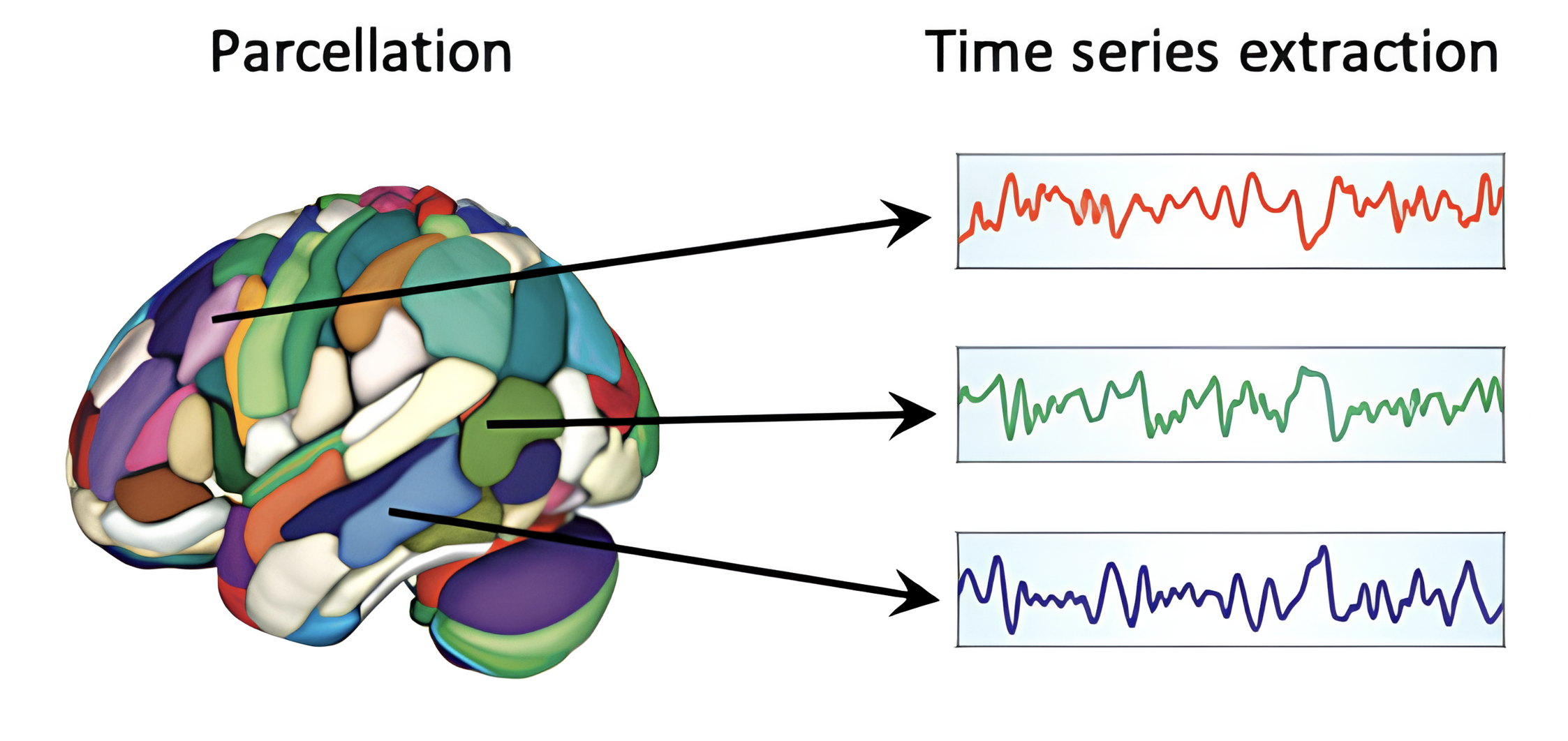
Illustration of the process of extracting regional time series from a parcellated brain. After the brain is divided into regions, the fMRI signal from all voxels within each region is summarized into a single time series that describes how activity in that region fluctuates over time. These regional time series form the basis of many downstream analyses, including resting-state functional connectivity and graph-theoretical network analysis. Adapted from Baxter (2023)
Extracting Regional Time Series with Nilearn
In Python, one of the most common ways to extract regional time series is through Nilearn. Here is the basic overview.
It’s not necessary at the moment to understand everything about Nilearn. For now, simply have a quick glance to familiarize yourself with the terms such as Nilearn (a Python package), parcellation atlas, extracting time series, location of a file, confounds file.
A typical workflow looks something like:
from nilearn.maskers import NiftiLabelsMasker

masker = NiftiLabelsMasker(
    labels_img=atlas_filename,
    standardize=True
)

timeseries = masker.fit_transform(
    func_file,
    confounds=confounds_file
)
At a high level:
labels_img=atlas_filenametells Nilearn (the Python package) which parcellation atlas to use.standardize=Truestandardizes the extracted time series, making them easier to compare across regions.func_filetells Nilearn the location of our preprocessed resting-state fMRI scan.confounds=confounds_filetells Nilearn the location of our confound file to account for nuisance signals during extraction (see more details below).
When fit_transform() is called, Nilearn:
Loads the preprocessed resting-state fMRI scan.
Applies the chosen brain parcellation.
Combines voxel-level signals within each region (since each region may contain thousands of voxels).
Extracts a regional time series for every brain region.
Accounts for nuisance signals using the confounds file.
The output is a matrix where:
Rows correspond to time points.
Columns correspond to brain regions (or vice versa)
This matrix becomes the starting point for many downstream analyses, including functional connectivity and graph theory.
We have already completed this step for you. Thus, you will be working directly with these regional time-series data.
What Are Confounds?
You may remember the file from the preprocessing data (/func folder):
sub-032301_ses-01_task-rest_acq-AP_run-01_confounds.txtThis file contains measurements that may introduce unwanted variation into the fMRI signal, including:
Head motion
Physiological fluctuations
Scanner-related artifacts
Signals from non-neural tissues
These sources of variation are often referred to as nuisance signals because they can influence the fMRI signal without reflecting actual neural activity.
For example, imagine that a participant briefly moves their head during the scan. This movement may cause signal changes across many brain regions simultaneously. If we do not account for this movement, we might mistakenly interpret the resulting signal changes as meaningful brain activity.
The confounds file provides measurements of these nuisance signals so that they can be statistically controlled for during analysis.
In simple terms, the analysis attempts to separate:
Observed Signal
=
Brain Activity
+
Noise
and remove as much of the unwanted noise component as possible.
The goal is to ensure that the resulting time series more accurately reflect neural activity rather than unrelated sources of variation.
A Reminder: The Data Have Already Been Preprocessed
It is important to remember that the data we are working with have already undergone substantial preprocessing.
As described by the LEMON dataset authors, preprocessing included steps such as:
Discarding the first five volumes for signal equilibration
Motion correction
Distortion correction
Coregistration between functional and structural scans
Denoising
Band-pass filtering
Variance normalization
Transformation into MNI space
In some research projects, scientists may choose to repeat or modify preprocessing depending on the specific questions they wish to answer.
For the purposes of this competition, however, the preprocessed data provided by the LEMON dataset are more than sufficient for meaningful scientific analyses.
To further make the dataset more accessible, we have gone one step further and already extracted parcellated data for many of the analyses used throughout the competition. This allows participants to focus on analyzing the regional time series data, understanding brain networks, and answering scientific questions without needing to download and process hundreds of gigabytes of MRI data—a process that can require substantial storage space, computing resources, and many hours of downloading and computation.
TL;DR We parcellated the data and extracted regional time series for you. You will be doing analysis using regional time series data.
What Comes Next?
Now that we have transformed the fMRI data into regional time series, we are ready to answer the next question:
How can we determine whether two brain regions are functionally connected?
In the next section, we will learn how time series are transformed into resting-state functional connectivity (rsFC) matrices and how these matrices are fundamental to analyzing resting-state data.
Before moving on, take a moment to make sure you are comfortable with the following concepts:
The difference between raw and preprocessed neuroimaging data
The difference between resting-state fMRI (rs-fMRI) and task-based fMRI
The concepts of brain parcellation, regional time series, and functional connectivity
The idea of large-scale resting-state networks, including the Yeo 7-Network Atlas
The differences between the AAL and Schaefer atlases
The role of Nilearn in extracting and analyzing neuroimaging data
Do not worry if you do not remember every detail. Try to understand the big picture and how the different pieces fit together. You can always return to earlier sections later if you need a refresher.
- Lewis, J. D., Theilmann, R. J., Townsend, J., & Evans, A. C. (2013). Network efficiency in autism spectrum disorder and its relation to brain overgrowth. Frontiers in Human Neuroscience, 7. 10.3389/fnhum.2013.00845
- Schaefer, A., Kong, R., Gordon, E. M., Laumann, T. O., Zuo, X.-N., Holmes, A. J., Eickhoff, S. B., & Yeo, B. T. T. (2017). Local-Global Parcellation of the Human Cerebral Cortex from Intrinsic Functional Connectivity MRI. Cerebral Cortex, 28(9), 3095–3114. 10.1093/cercor/bhx179
- Thomas Yeo, B. T., Krienen, F. M., Sepulcre, J., Sabuncu, M. R., Lashkari, D., Hollinshead, M., Roffman, J. L., Smoller, J. W., Zöllei, L., Polimeni, J. R., Fischl, B., Liu, H., & Buckner, R. L. (2011). The organization of the human cerebral cortex estimated by intrinsic functional connectivity. Journal of Neurophysiology, 106(3), 1125–1165. 10.1152/jn.00338.2011
- Baxter, L. (2023). Functional network construction using functional MRI. In Connectome Analysis (pp. 45–69). Elsevier. 10.1016/b978-0-323-85280-7.00002-6